

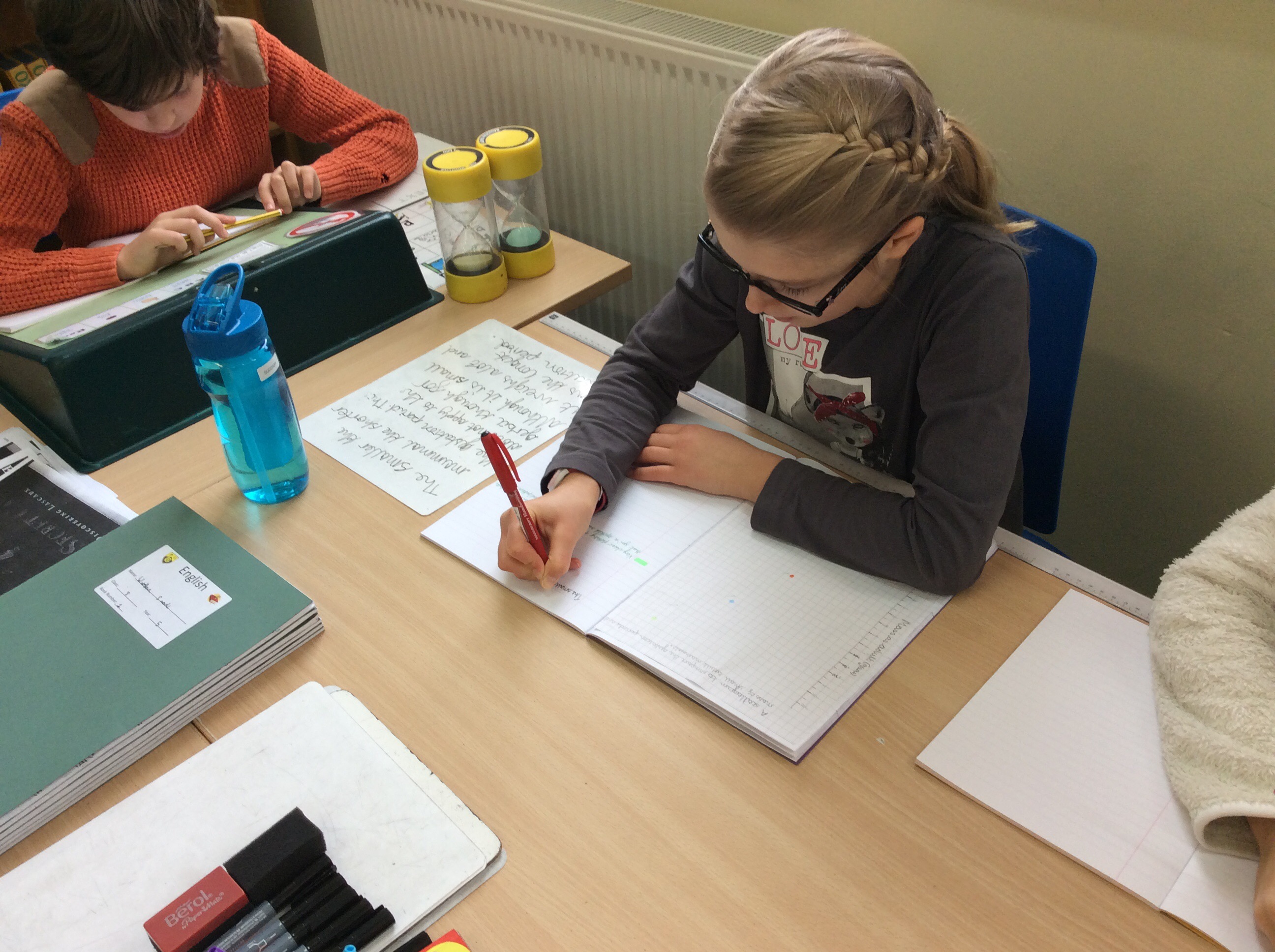
On Wednesday morning in our Science lesson, we plotted a scattergram which compared the mass of a small adult mammal to the lengths of their gestation periods. The children then used the data to explain the main trends/patterns, with most finding that the larger the mass of the smaller mammal, the longest the gestation period, except for one anomaly!

I enjoy drawing graphs and I especially enjoyed this one as scatter graphs are my favourite as you get to compare two measurements so that means there are more numbers involved.
I enjoyed it to Sophie.
This task was really fun but it was harder than I expected it to be; however I did love the animal theme!
I haven’t drawn a stattergram for a long time and this gave me time to practise and see what I remembered. I found looking at the data very interesting and was surprised at the anomaly!
I enjoyed this lesson because I love drawing graphs and it was fun anyway
I enjoyed drawing the scattergrams and this lesson on scattergrams was the best one so far as there are more tricky numbers to work with. Such as 19 which is not an even number so it’s tricky to place it on the graph.
I enjoyed this as it informed me abot the time duration of different small mammals
I liked this session because guinea pigs are involved1
I really enjoyed plotting.